MFT Banking Transaction Module
Developed and Designed a New Section for Syncrofy’s Web Application
Overview
CoEnterprise sought to enhance their Syncrofy platform by integrating a new Managed File Transfer (MFT) Banking Transaction Module. The goal was to provide clients with a robust tool to handle high volumes of banking transactions securely and efficiently. Under tight deadlines, I was tasked with designing this new module, ensuring it seamlessly integrated with the existing platform while addressing the unique needs of various clients.

My Role
- Position: UX/UI Designer
- Duration: 2 Months
- Team: Collaborated primarily with a product manager and a developer
- Responsibilities:
- Researching MFT banking transactions to understand user needs and regulatory considerations
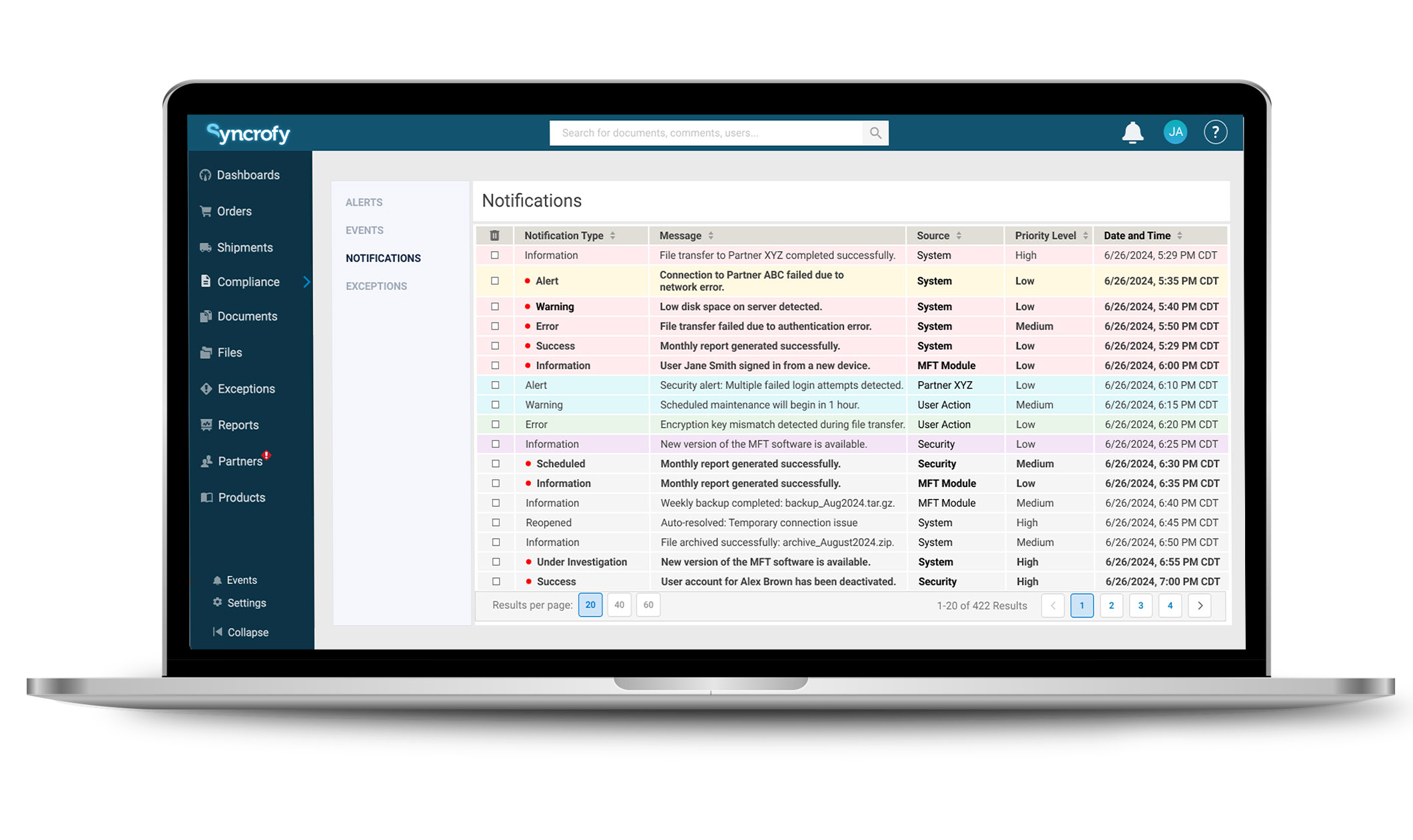
- Designing Notification section of the website.
- Designing the MFT Banking Transaction Module and Notifications section
- Ensuring designs were accessible (AA-compliant) and adhered to security best practices
- Modifying the existing design system to improve usability and prepare for application across other platform sections

The Challenge
- Limited Knowledge & Guidance: I started with minimal understanding of MFT banking and little initial direction from stakeholders.
- High Transaction Volumes: Some clients processed up to 10,000 transactions per hour, necessitating a design that could handle vast amounts of data efficiently.
- Security Concerns: Needed to display essential transaction information without exposing sensitive data that could be exploited by hackers.
- Consistency & Scalability: The design had to integrate with Syncrofy’s existing UI and be adaptable for future use in other parts of the platform.
- Tight Deadlines: The project required quick turnaround without compromising on quality or user experience.

The Process
Research & Discovery
- Self-Education: Utilized resources like Perplexity to learn about MFT banking transactions, common data included, and industry best practices.
- Stakeholder Interviews: Conducted an in-depth interview with a banking manager from a major bank to gain insights into user needs, pain points, and security considerations.
- Existing Platform Analysis: Examined Syncrofy’s current design to identify reusable elements and areas needing improvement, such as left-right navigation issues and horizontal scrolling challenges.
Design Strategy
- Recreating the Existing Design in Figma: Transferred current Syncrofy UI elements into Figma to facilitate easy modifications and ensure consistency.
- Persona Development: Created user personas to keep the design user-centered, focusing on the needs of banking professionals handling high-volume transactions.
- Information Architecture: Mapped out the data hierarchy to prioritize essential information like transaction status, errors, and processing times.
UI/UX Design
- Simplifying Navigation: Addressed left-right navigation issues by redesigning the layout for easier access and flow, reducing the need for excessive horizontal scrolling.
- Accessibility Focus: Ensured all designs were AA-compliant, using appropriate font sizes, color contrasts, and clear headings to improve usability for all users.
- Visual Enhancements: Introduced subtle color coding to highlight transaction statuses (e.g., errors, delays) for quicker recognition without deviating from the platform’s aesthetic.
- Notifications & Alerts:
- Redesigned Notification System: Modified the notification behavior so that messages would persist until manually dismissed, preventing important alerts from disappearing prematurely.
- Alerts and Events Pages: Created dedicated sections where users could filter and manage notifications, prioritizing by date, severity, or transaction type.
Collaboration & Feedback
- Developer Coordination: Regularly consulted with the developer to ensure technical feasibility and to refine designs based on practical constraints.
- Stakeholder Reviews: Presented design iterations to the product manager and stakeholders, incorporating their feedback to align with business goals and client expectations.
- Iterative Improvements: Made adjustments based on feedback, particularly concerning security measures and the potential application of the design system to other platform areas.

The Solution
- MFT Banking Transaction Module:
- Dashboard View: Provided a comprehensive overview of all transactions with the ability to handle thousands of entries efficiently.
- Advanced Search & Filters: Enabled users to quickly locate specific transactions using filters like date, time, status, and transaction type.
- Detailed Transaction Pages: Offered in-depth information on individual transactions, including processing times, completion status, and any errors encountered.
- Improved Navigation:
- Optimized Layout: Resolved existing navigation issues by streamlining the interface, reducing the reliance on horizontal scrolling.
- Consistent Design Elements: Used standardized components to maintain a cohesive look and feel across the platform.
- Enhanced Notifications System:
- Persistent Notifications: Ensured important alerts remained visible until addressed by the user.
- User-Friendly Management: Allowed users to sort, filter, and dismiss notifications efficiently.

Results
- Stakeholder Satisfaction: The redesigned module was well-received by stakeholders, who appreciated the seamless integration with the existing platform and the potential for the design to be applied to other areas.
- Improved Usability: Early feedback indicated that users found the new module intuitive and helpful in managing high volumes of transactions.
- Security Compliance: The design successfully balanced the need for detailed transaction information while adhering to security protocols to protect sensitive data.
- Accessibility: By meeting AA compliance standards, the module became more usable for a broader range of users, enhancing overall user experience.
Reflection
- This project was a valuable exercise in rapid learning and adaptability. Starting with limited knowledge of MFT banking transactions, I leveraged research and stakeholder insights to deliver a solution that met both user needs and business objectives under tight deadlines. Key takeaways include:
- Proactive Learning: Taking initiative to educate myself on unfamiliar subject matter was crucial.
- Effective Communication: Regular interaction with the developer and product manager ensured alignment and feasibility.
- User-Centered Design: Focusing on the end-users’ needs led to a more intuitive and efficient interface.
- Scalable Solutions: Designing with scalability in mind allowed for the potential application of the new design system across the platform.


